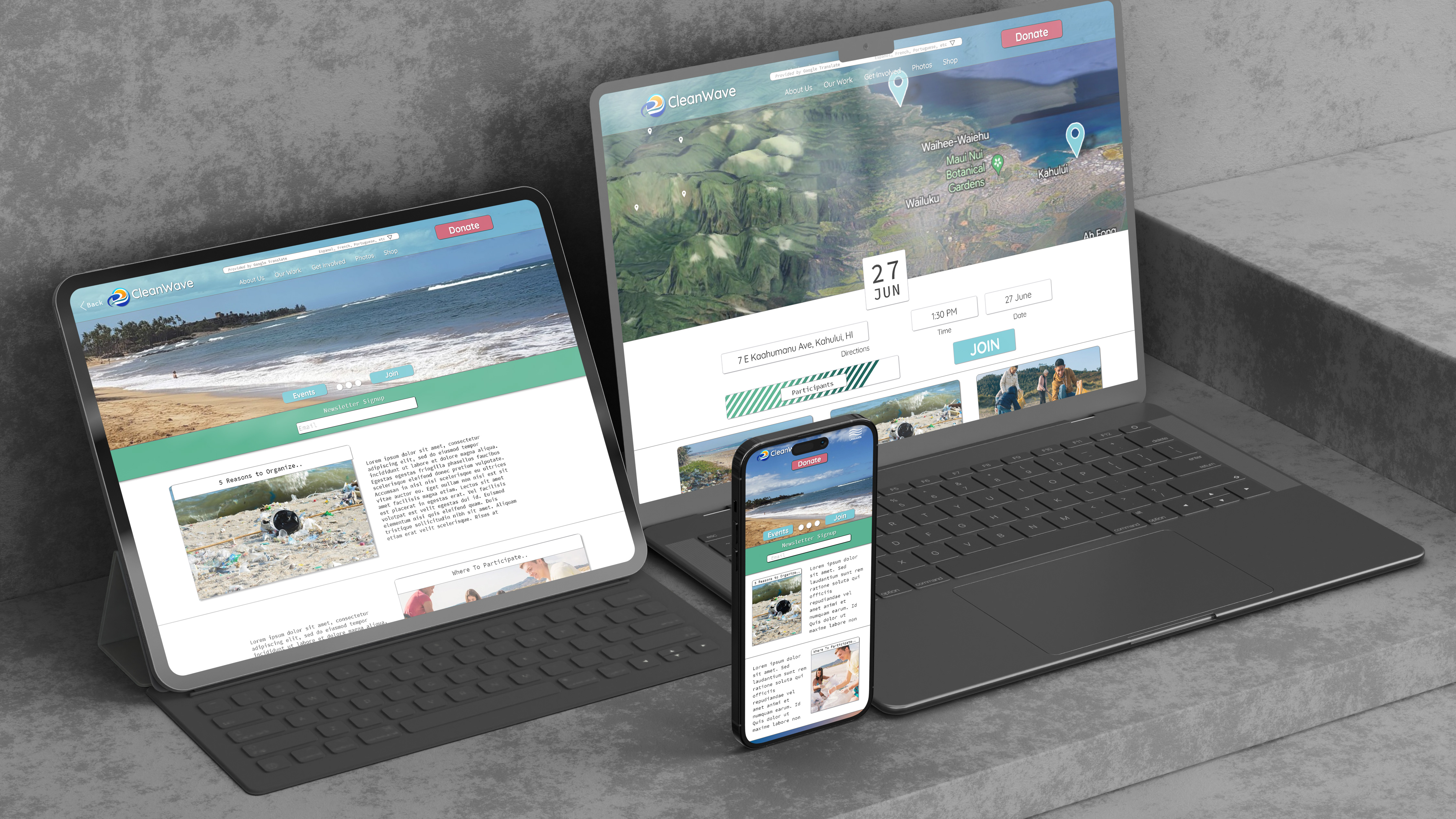
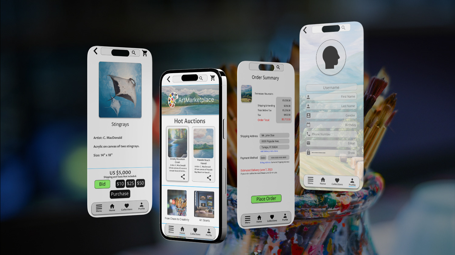
What is HomeSweetHome?
HomeSweetHome is a portfolio project website designed to help users find and apply to rent apartments and houses. The service targets users between the ages of 20 and 55 who are moving to a new city or area. The primary goal is to make the process of searching for a new home easy, fast, and informative.
Role: UX Researcher, UX Designer
Time: 2 Weeks
Responsibilities: Conducting interviews, user studies, developing paper and digital wireframes, both low and high-fidelity prototypes, managing accessibility, design iterations, and creating the responsive layouts.
The Problem
Current online rental websites do not provide enough information on surrounding neighborhoods and locations and sometimes require users to fill out different applications for different property managers.
The Goal
HomeSweetHome will provide additional information on neighborhoods and living conditions supplied by property managers, verified reviewers, and offer a standardized application process that can be applied to all properties.
The User Research
I conducted user research to understand the needs and wants of users who are looking for a new place to rent. I used a variety of methods, including surveys, interviews, and usability testing. Besides offering a wide variety of affordable listings, my research showed that users were also looking for a website that was reliable, had accurate information, and was user-friendly.
Personas
The Competitive Audit
The audit helped to establish user's typical goals and pain points when looking for new rental property. Common points such as different application forms for different properties and the lack of localized information on neighborhoods.
Ideation
Before sketching I laid out a sitemap for HomeSweetHome. When organizing the information architecture I choose to go with a hierarchical structure. Users are familiar with this type of website layout and it integrated well with the purpose of this project.
With the user goals in mind I worked on some quick ideation sketches. My main focus was on any primary functions the user would want access to when searching for or posting rental properties.
Wireframes and Low-Fidelity Prototypes
After sketching the paper wireframes, I used Adobe XD to create the low-fidelity mockups and prototypes. This helped me organize the information to create the best experience for the user.
Responsive Layout
Usability studies were conducted using the low-fidelity prototype. Affinity mapping the users pain points led to adding additional information slots for property listings.
High-Fidelity Prototypes
The high-fidelity prototype follows the same user flow as the low-fidelity prototype, but with design changes made after usability studies. Also, layout and navigation improvements as suggested by user feedback.
Takeaways
Impact: "Detailed property descriptions are crucial for me. I need to know all the essential information about the rental before considering it."
What I learned: By simplifying the search process, offering comprehensive local information, and providing an intuitive user interface, proper design can alleviate the stress and uncertainty associated with finding a new home.


